Brand & Website DesignARTRAGE
This is a Strange Animals project. I contributed brand development, art direction and design.
ARTRAGE needed a refresh to re-engage with its audience. We kept their iconic logo, but we built something new around it.
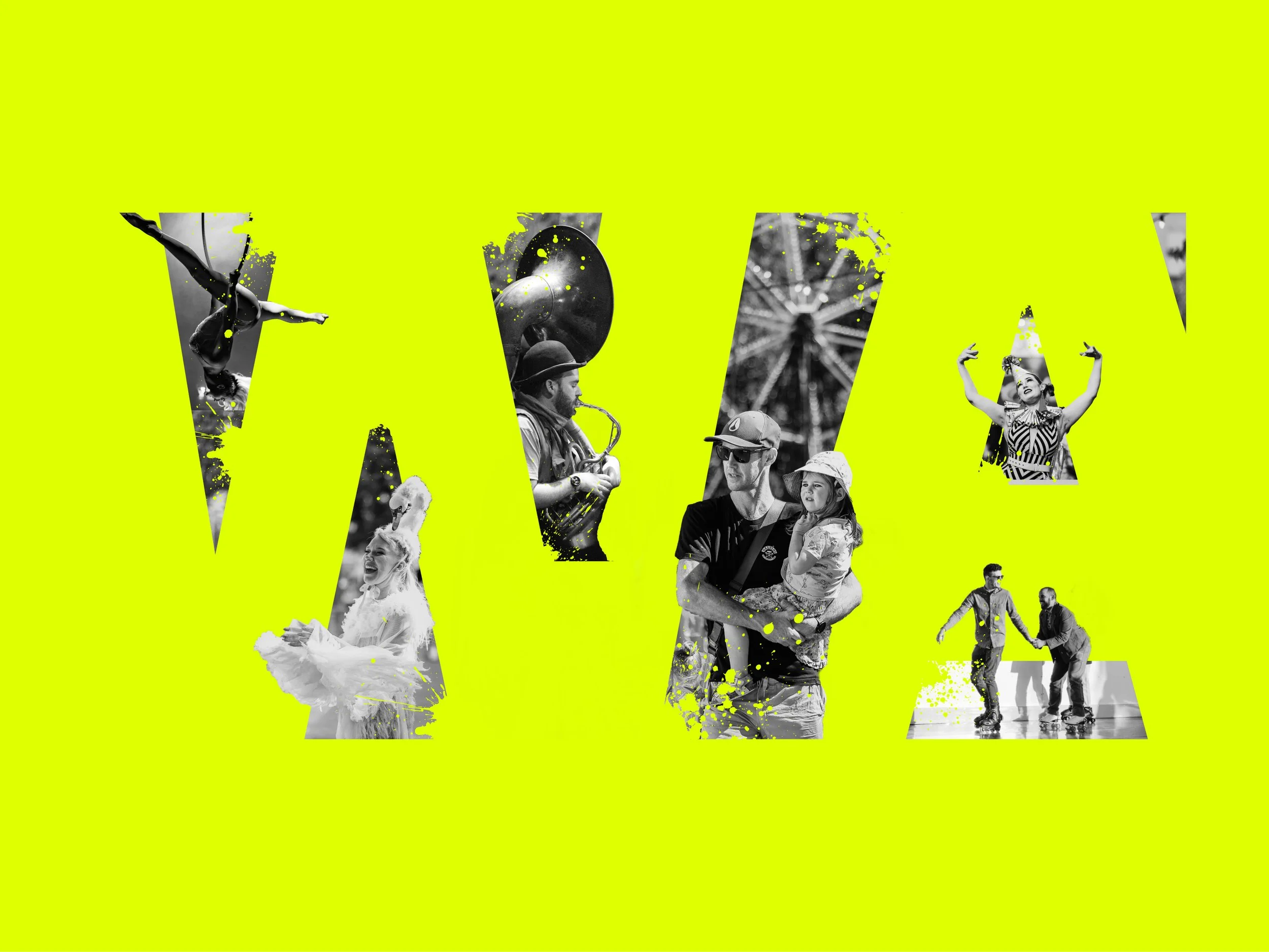
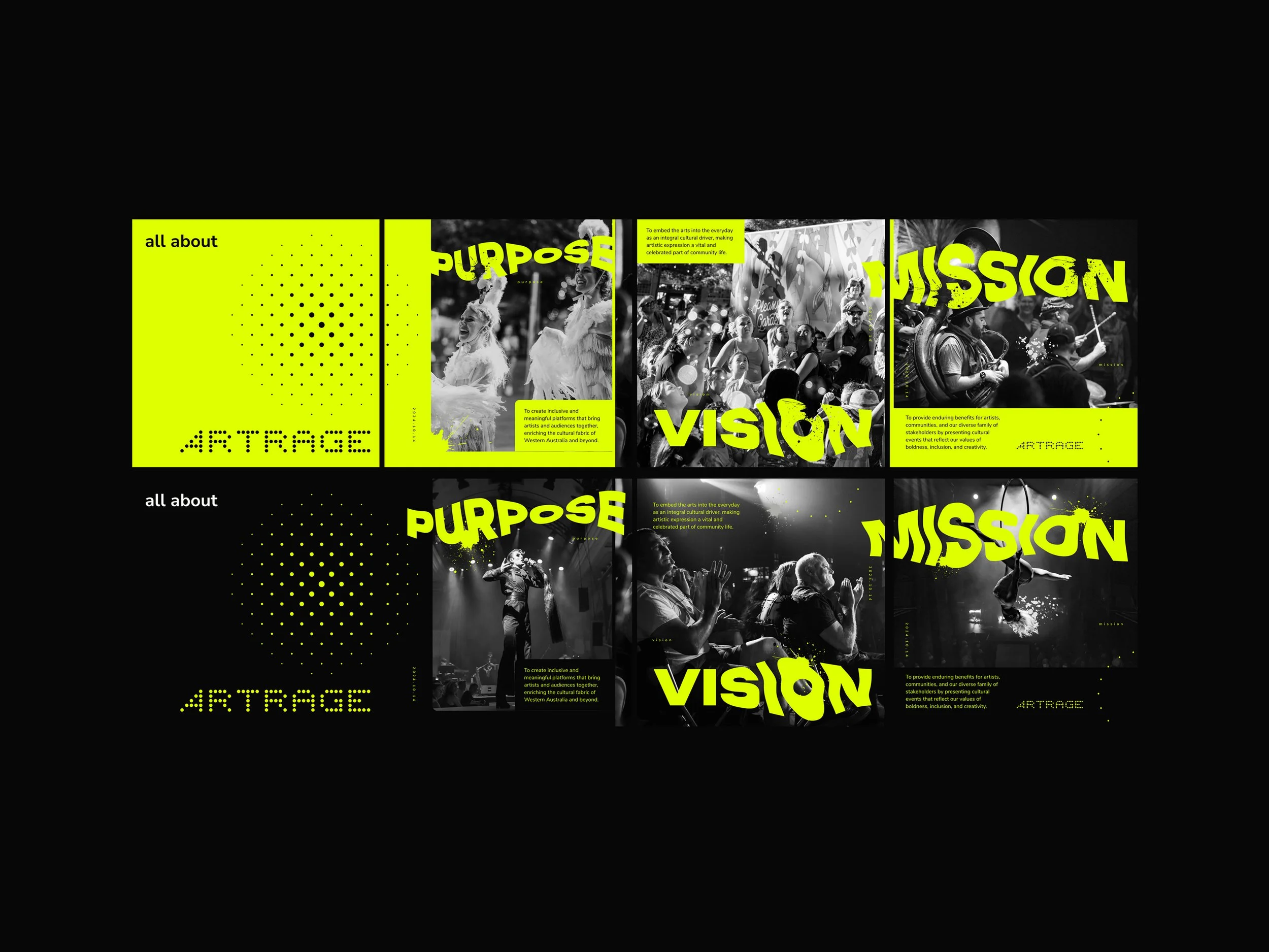
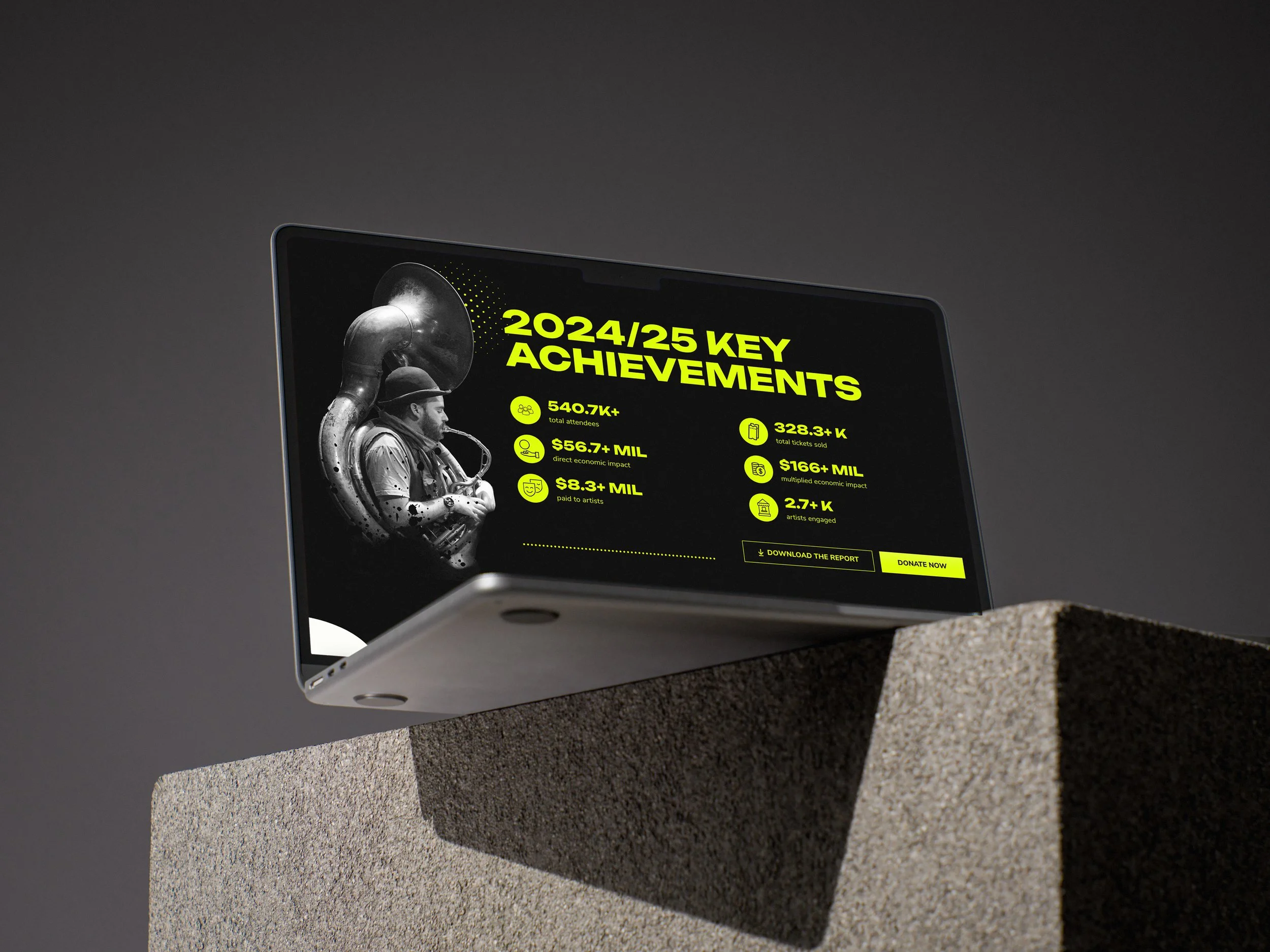
Approaching ARTRAGE’s new visual identity, we at Strange Animals looked to keep what we felt was good and foundational (bold type, minimal colour palette, photo treatments) and enhance it with something new and vibrant. This was not just a chance to reconnect with a core audience, this was a chance for ARTRAGE to embody art loudly and proudly, and this was our challenge.
So how do we show the high-impact work ARTRAGE does for the Western Australian arts industry? The result was an exciting core brand colour - a high-vis yellow that jumps out at you, playful typography that breaks out of the box, organic paint splatters, and dynamic graphics, textures and image framing.
I also built in a greater connection to their dotted logo (a foundational piece of the puzzle) through a collection of graphic dot elements. The paint splatters were intended to convey the emotions of the arts (impulsivity, freedom and creativity). The graphic dots on the other hand represented elements like lighting, stages, audiences and crowds, organisation, unity and togetherness. They also provided a robust, functional, and decorative motif the marketing teams could employ for a variety of applications.
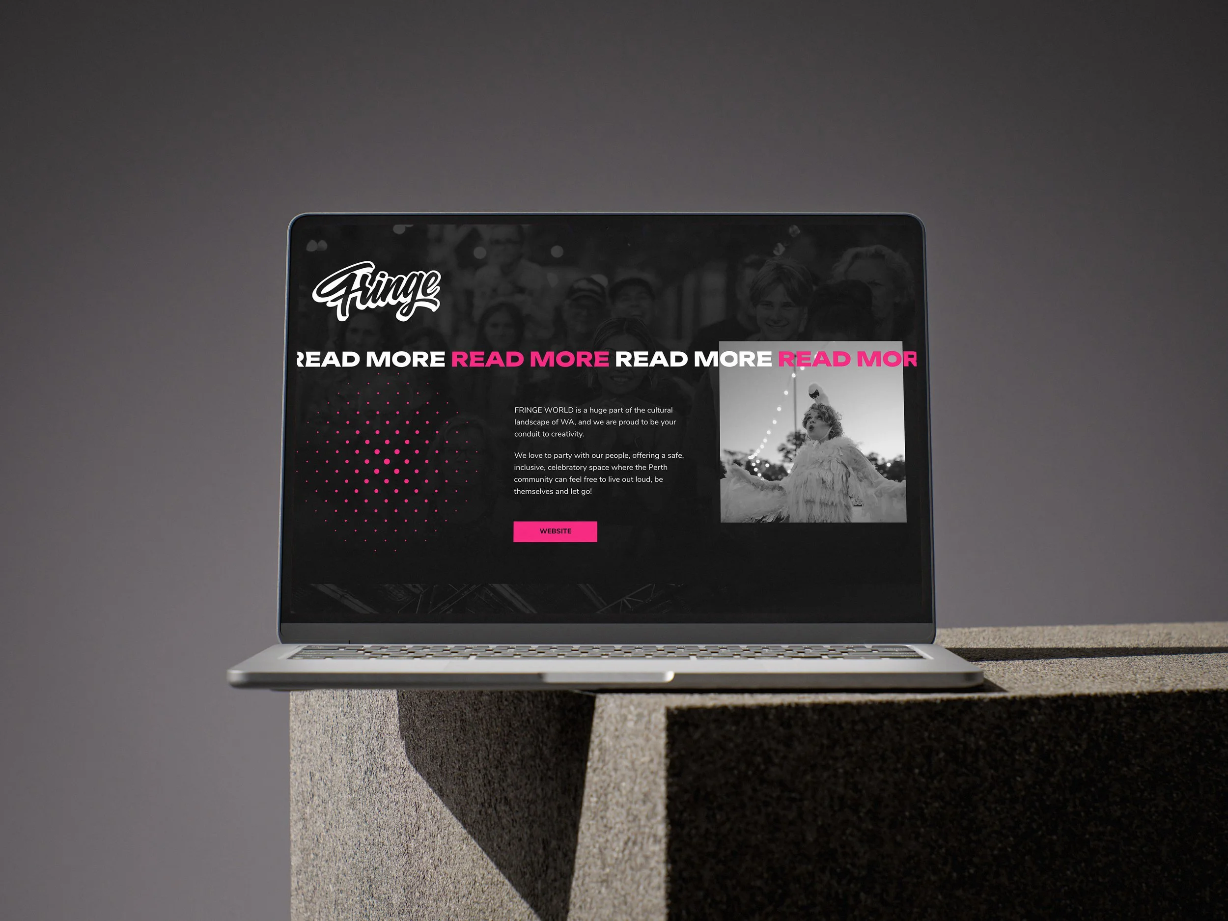
As we looked to incorporate ARTRAGE’s 3 core event brands into the website, we applied the dot motif to a creative iconographic interpretation of each:
The ARTRAGE identity work also included a comprehensive brand guide to aid the marketing team in their future application of the brand.