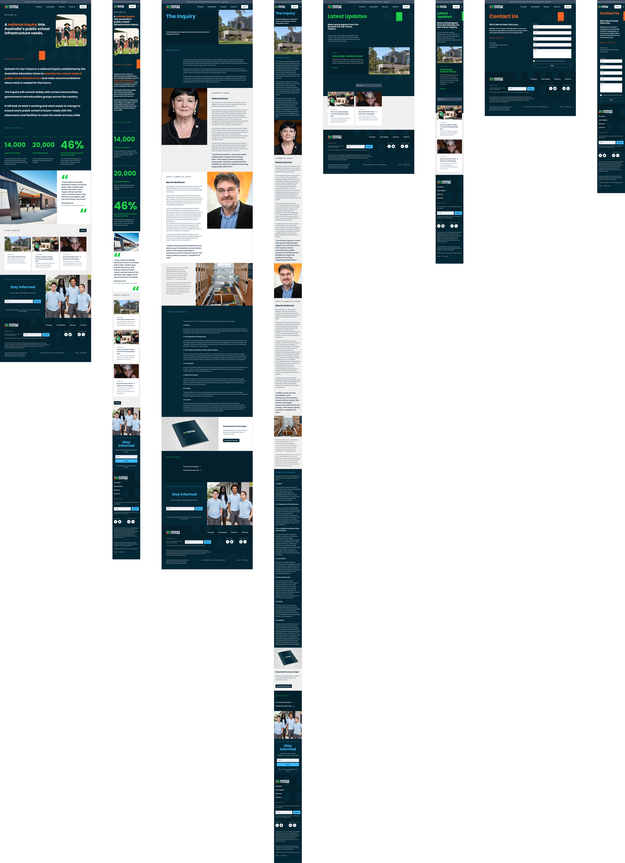
Brand & Website DesignSchools for our Future
This is a Strange Animals project. I contributed brand development, art direction and design.
A campaign identity to bridge the gap between the community and government.
Schools for our Future is a national inquiry into Australia’s public school infrastructure needs.The identity had bridge two worlds - the families, community and their needs, and the bureaucracy that determines whether those needs are met. The brand needed to speak with absolute clarity, feeling like an approachable helping hand to part of its audience (the community), and a strong, intelligent, professional entity to the other (government).
The identity required a new logo, but typographically had to feel reasonably aligned with the AEU’s (Australian Education Union) other campaign For Every Child (FEC). The identity in general also had to suitably fall in line with FEC, and the AEU’s other entities (Rebuild With Tafe, and the AEU brand itself). It was this that led me to a dark teal/blue as the core colour, noting that a similar shade would eventually be a bridging colour across all the brands. While I experimented with a set of blues, ultimately the identity retained supporting colours from FEC to tie it more closely.
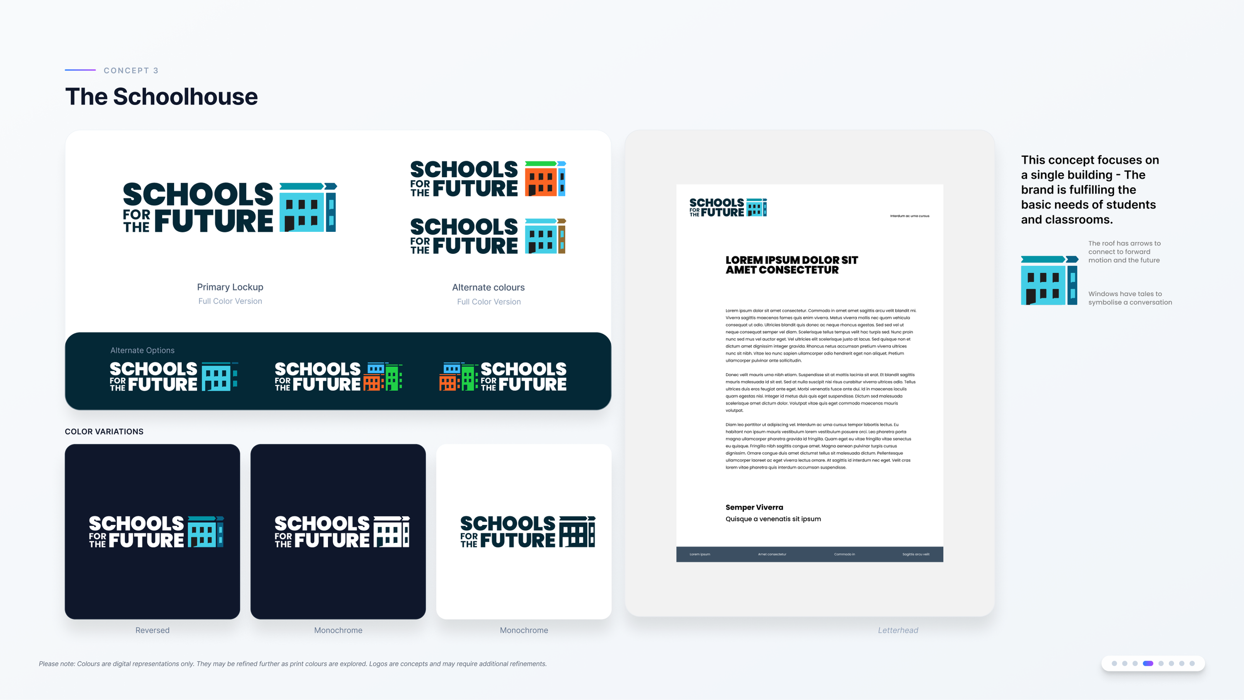
Initial concepts for the symbol.
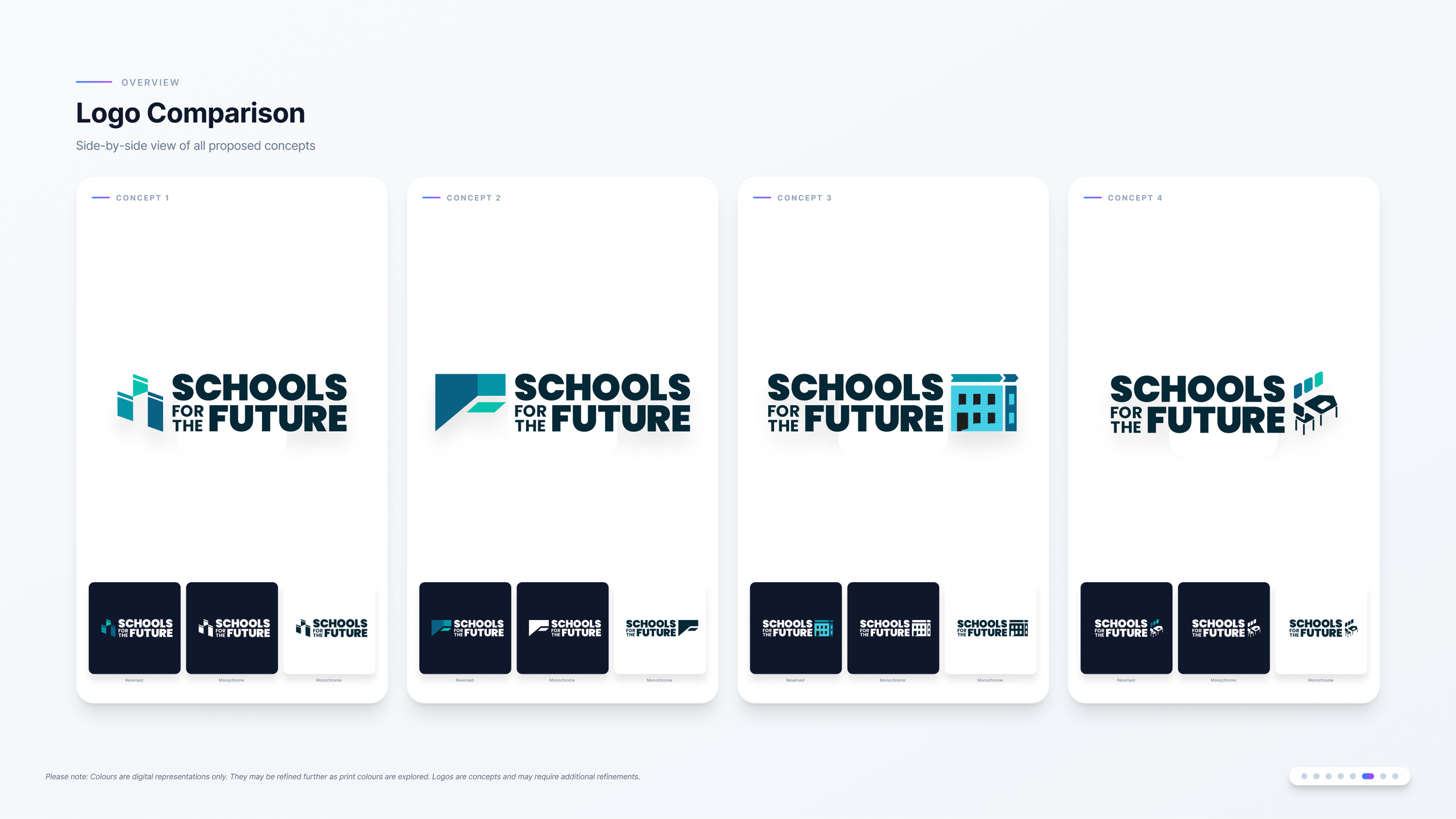

The approved and final symbol and logotype.
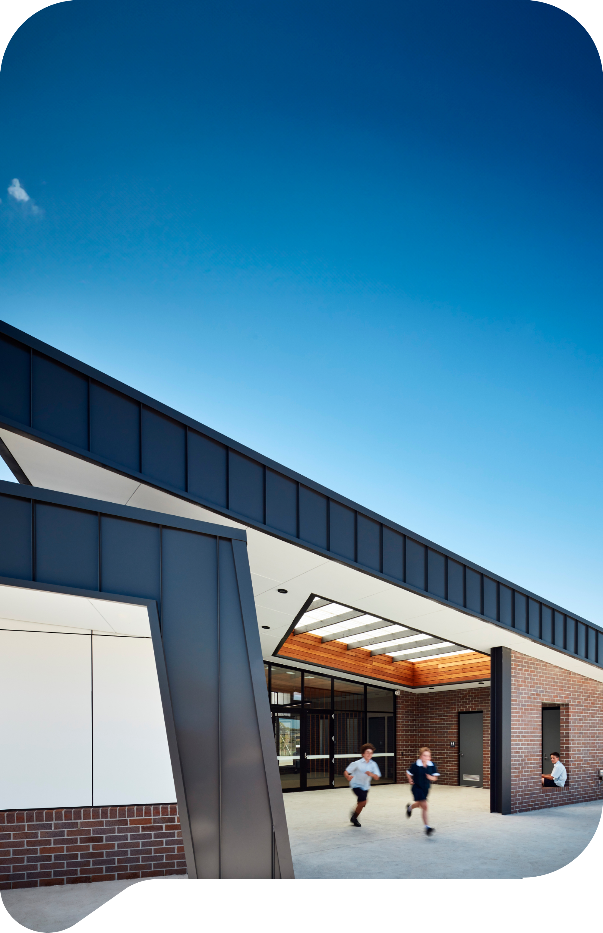
The symbol developed for the brand reflected a set of school buildings, giving it a future-focused and hopeful outlook. The 3 colours selected tied the symbol to the For Every Child campaign as required by the brief. I wanted to add some additional meaning hidden within the logo. To accomplish this I added “tails” to the window and doorway blocks, to have them subtely reflect a “speech bubble” and symbolise dialogue and conversation, both within schools and between the community and government. I then applied this symbol as a visual motif throughout the brand, utilising it for content and image frames, as well as a repeating pattern.
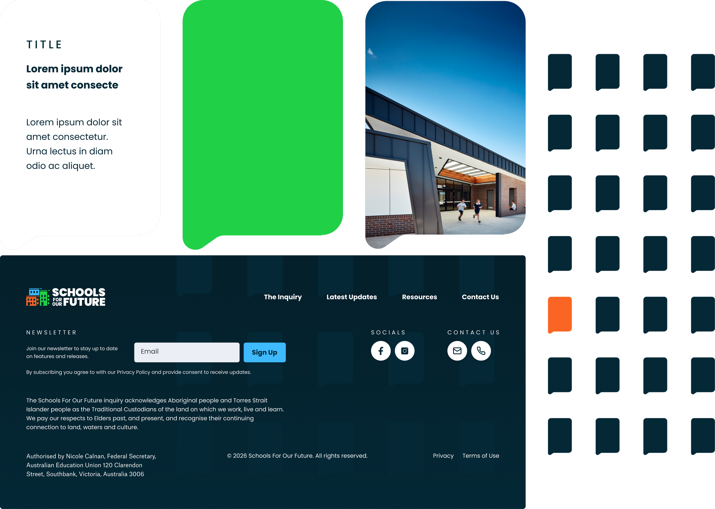
The brand window / speech bubble motif in action.
The sole deliverable from a application point of view when developing the brand was the accompanying website. We designed this to be highly usable, clear and concise.